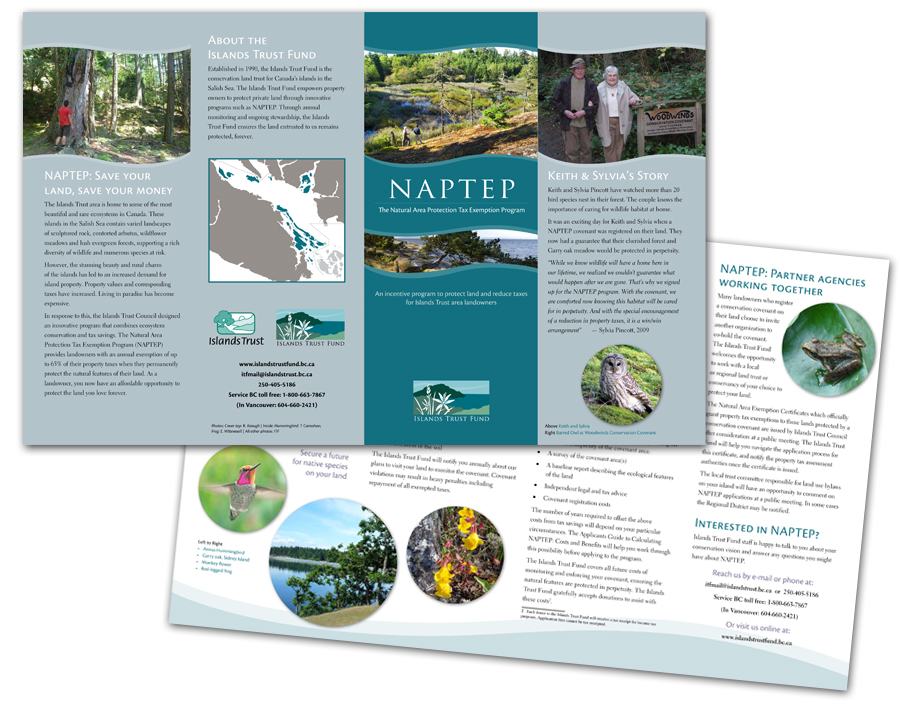
This brochure maps out a program within an organization. The challenge was to create a look that connected with the whole while also standing out as a specific initiative. This was done through the adoption of a single colour from the parent-brand. The layout features complex information presented in a clear and concise manner with graphic elements unique to the program.
NAPTEP Brochure
Multi-page